Honey Bee Pediatric Therapy
Honey Bee is a pediatric physical therapy practice serving the Metropolitan DC area. The goal was to create an appealing visual identity for adults and children alike. The visual language appears welcoming to the kids Honey Bee serves and trustworthy to their parents.
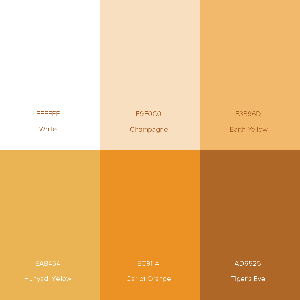
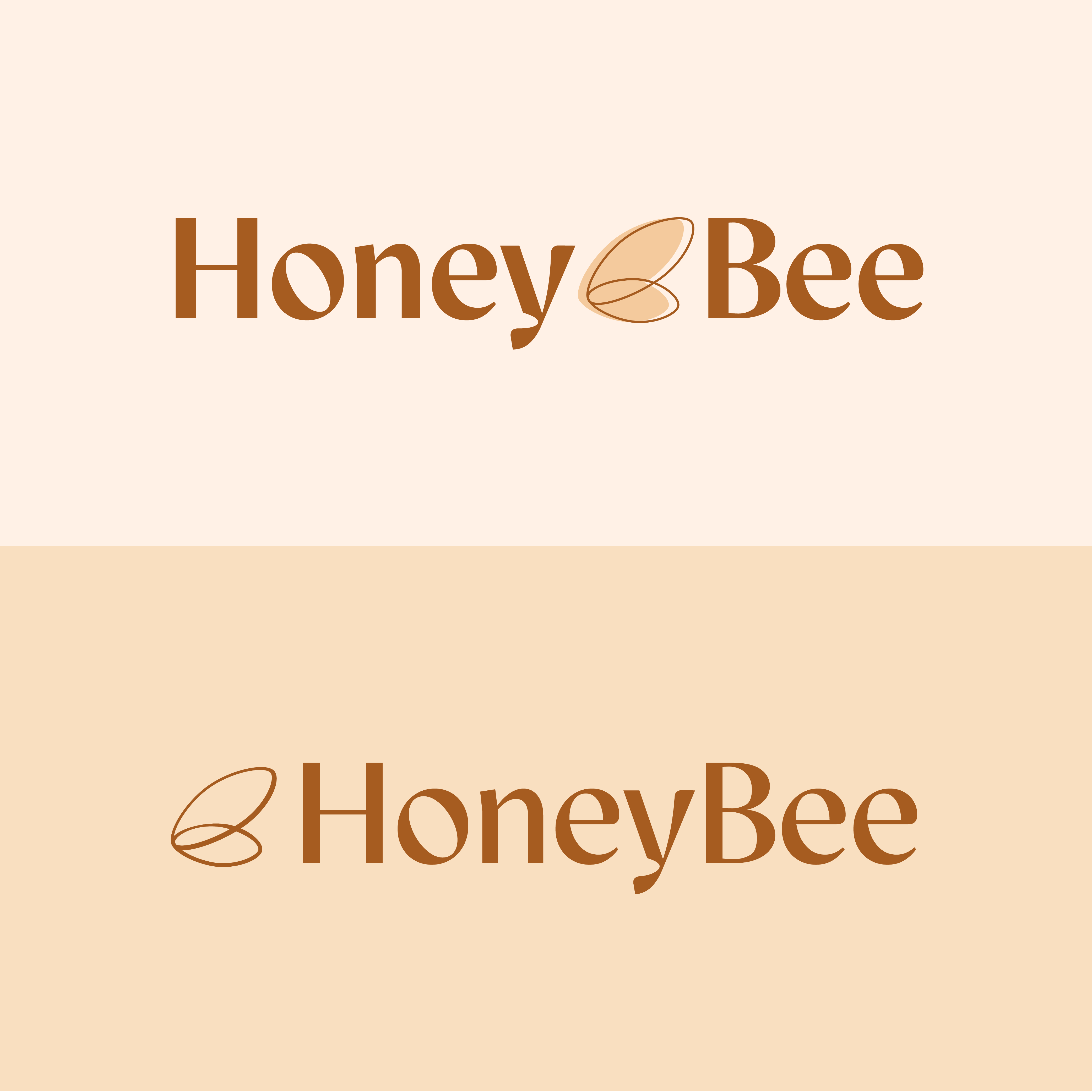
A warm palette, typeface that is clean, and sophisticated—but not sterile, and a fresh, pared-down take on traditional bee imagery all contribute to a sense of dependability you seek in a healthcare provider.
A warm palette, typeface that is clean, and sophisticated—but not sterile, and a fresh, pared-down take on traditional bee imagery all contribute to a sense of dependability you seek in a healthcare provider.




Color Palette and Logo Exploration
